How Shapes Affect Logo Design

Shapes are all around us and part of our everyday life. And, whether we believe it or not, they play an important role in building and defining a brand logo that serves as an anchor for an organization in its industry. Shapes in brand logos are often overlooked or misunderstood by business owners with most emphasis being focused on color, font type and format. It is important to give shapes the same amount of attention when creating a logo to:

  • Symbolize different ideas
  • Direct the eye from one element to the next
  • Convey emotion and mood
  • Create trust and professionalism
  • Deliver a sense of depth
  • Connect with an audience

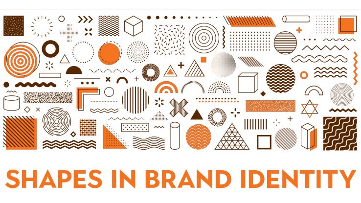
Shape elements, including circles, squares, rectangles, triangles, vertical and horizontal lines, organic shapes and spirals all communicate different meanings. Let’s explore how each element translates in a logo and provides a connection point for current and potential customers.

Circles
A common feature in logo design, circles are used in 20 percent of the most recognized brands. Using a circle in a logo conveys positive emotional messages through unity, friendship, commitment, strength, and steadiness. They connote softness, bonding, consistency, sturdiness, and reliability. In some instances, they imply marriage and partnership to show stability and endurance.

Squares & Rectangles
Another popular and common design form, squares and rectangles create an idea of proportion, balance and dependability. While the corners found in these elements are sharp and abrupt, they also help to inspire trust, safety, maturity, intelligence and strength about the brand for consumers.

Triangles
The triangular shape in logo design shows dynamic power, hierarchy, and continuous motion and/or improvement. The shape of a triangle seems to be pushing in a specific direction which helps to give a perception of brand innovation and resilience. Again, the sharp corners help to emulate trust, safety, maturity, intelligence and strength for consumers

Lines
Lines tend to be the least popular and are often used as a secondary element, but still can significantly impact logo design for the better. Vertical lines can portray strength, sophistication, and, in some instances, aggression. Horizontal lines convey community, tranquility, and calm.

Organic Shapes & Spirals
Not every logo has to be based on circles, squares, rectangles, or triangles. The use of organic shapes, which are naturally occurring forms (shapes), and spirals are often used to create unique logos that are a literal portrayal of a brand. Spirals are used to be centralizing, transformative and are often considered to be hypnotic as well. Organic shapes make people feel warm and comforted by portraying well-recognized elements that tug at heart strings or good memories.

Shapes are building blocks and create patterns, providing something for our brains to memorize and recognize. The use of different shapes, or the use of one strong shape, in logo design can help to create an emotional and psychological bond between a brand and its consumers. It is important to understand how shapes affect your logo and how to incorporate them in order to create a brand connection.

The Psychology of Color & Your Logo

The biggest brands in the world are defined by their logo and the color that represents them. Multiple studies have shown that a brand’s color influences 60 to 80 percent of a consumer’s decision to purchase a product or service. Specifically, 84.7% of buyers claimed color as the primary draw to a brand. While the use of color is always subjective, it is also closely linked to a business’s brand identity and its ability to position itself with target audiences.

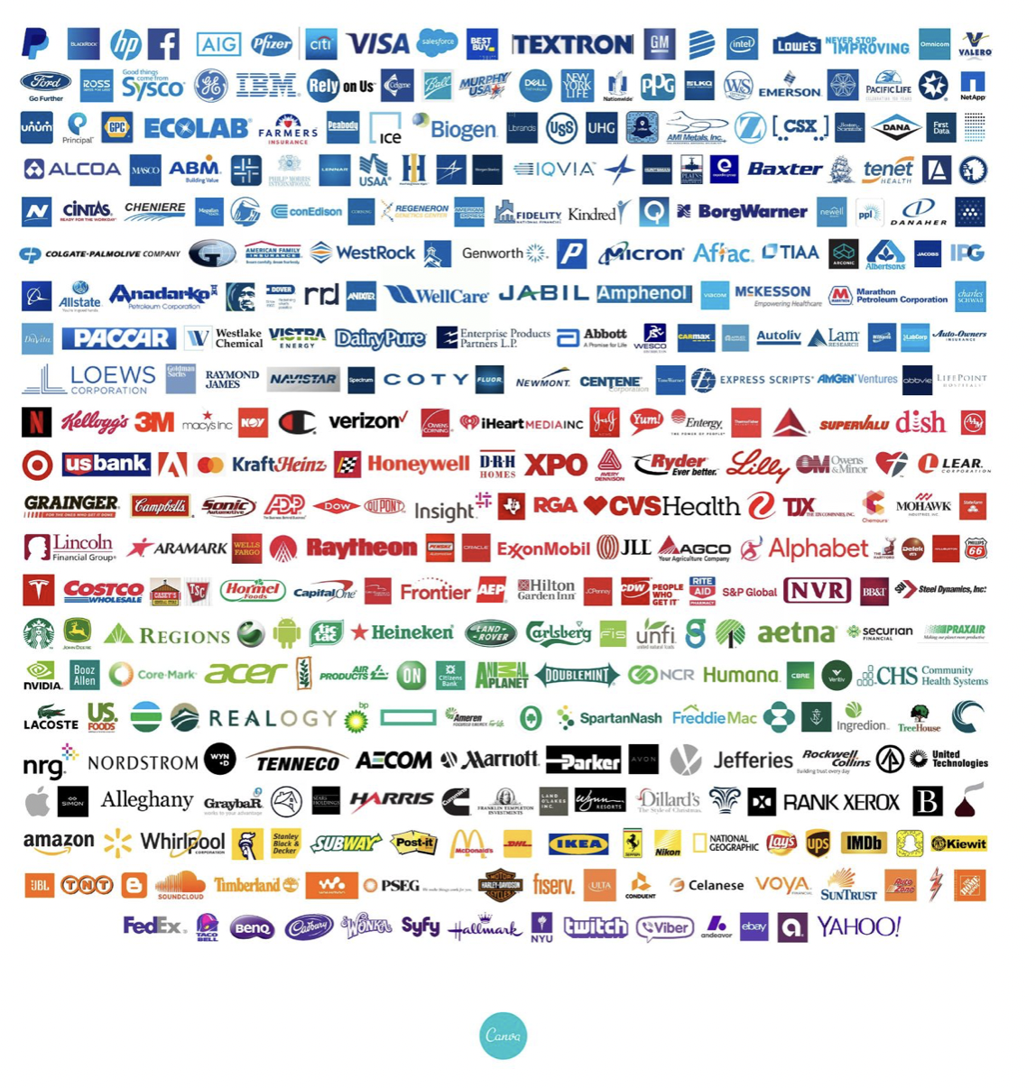
The psychology of color shows patterns of how people respond and form strong associations to certain hues in specific industries. Of the top 100 brands in the U.S., blue is the most popular color at 33 percent, followed by red at 29 percent and black (or grayscale) at 28 percent. Only 13 percent of those brands use yellow or gold.

Image credit: canva.com

The Marketo Engage blog by Adobe does a great job of breaking down the use of color in branding.

Red

Evokes a passionate and visceral response. It is a color that increases your heart rate, makes you breathe more rapidly, and activates the pituitary gland.

Color code: aggressive, energetic, provocative, attention-grabbing

Purple

Sophisticated yet mysterious color. The richness of this color tips its hat to the royalty and elegance found deep within us.

Color code: royalty, sophistication, nostalgia, mystery, spirituality

Blue

One of the most popular choices for a brand color, it is thought to put people at ease as it is reminiscent of the sky and ocean.

Color code: trustworthy, dependable, secure, responsible

Green

There is a wide variation between its shades and is synonymous with calm, freshness, and health. Deeper greens are associated with affluence and lighter greens are associated with serenity.

Color code: wealth, health, prestige, serenity

Yellow

Because yellow is reminiscent of the sun, it communicates hope and optimism. Yellow stimulates creativity and energy, and its brightness is especially useful to catch a customer’s eye.

Color code: positivity, light, warmth, motivation, creativity

Orange

Combines the brightness and cheer of yellow with the energy and boldness of red to make a color that is full of life and excitement.

Color code: vitality, fun, playful, exuberant


Brown

Speaks of earthly simplicity, as well as strength and durability. However, use caution as it also reminds people of dirt.

Color code: earthlike, natural, simplistic, durable


Black

Used by companies that wish to boast a classic sophistication. Black works especially well for expensive products.

Color code: prestige, value, timelessness, sophistication


White

Represents purity and cleanliness and is a popular choice for healthcare and child-related businesses.
Color code: pure, noble, clean, soft


As always, the use of color in branding and marketing is subjective and you never know when someone is going to love it or hate it … or be completely indifferent. However, the bottom line is that brand colors are critical to the success of an organization by keeping it front and center with the right target market.


Tips for Fixing 4 Common Branding Mishaps

The art of branding an organization can be a complicated process and mishaps happen!  When branding goes well sales rise and consumers get engaged, but when it goes bad the damage to an organization’s reputation can last for many years. Below are four common branding errors and some ideas to realign and get past them.

Mishap #1 – Inconsistent Use of Brand Across Digital Channels

The digital world is huge right now, and with the onset of the pandemic businesses need to be visible and easy to connect with online to thrive and grow.  A recent study by ClickZ Marketing Technology Transformation shows advantages of omnichannel marketing automation including 250% higher purchase frequency and 90% higher customer retention rates. Which means that having a strong and consistent presence on the top digital channels (see list below) is critical to success. Make it a point to review your channels on a weekly and monthly basis to ensure all graphics, visuals and content are sending the same message and speaking the same language. In fact, make it someone’s job to ensure brand usage is consistent!

Top Digital Channels:

  1. Website
  2. Email
  3. Social Media
  4. Mobile
  5. Display Ads
  6. Video

Mishap #2 – Disconnect Between Content Strategy and Brand Strategy

A brand strategy is the blueprint for building and growing a brand, basically the purpose of an organization … why it exists and what it does. Which is pretty much the foundation of a business. A content strategy is a tool to communicate what the organization is through content (i.e. print and digital channels). A misaligned content strategy dilutes a brand to the point it confuses and turns customers away creating little to no emotional connection to the brand. Look at your website … does it clearly articulate your mission and vision and how the product or service makes customers’ lives better?

Below are a few ideas on how to align content with branding.

  1. Create brand stories that include a value proposition and support the core identity of the organization.
  2. Implement brand guidelines for creating content that will be used on all marketing and communication channels.
  3. Develop campaigns for core business initiatives that are anchored in the organization’s brand values, mission, vision and value proposition.

Mishap #3 – Cutting Corners on Your Logo

A logo is a symbol that provides powerful brand recognition for your organization to consumers, investors, and competitors. Many factors can influence the development of a logo and often people will focus on getting the simplest and cheapest logo available because the process is daunting to them … or they just don’t see the ROI on really investing in a great logo. There are many online logo development websites available but creating a logo tailored for a business with a professional graphic designer can be quick, easy, and cost efficient. It is built around a concept and strategy, includes different variations and will grow for the long-term with a business. A good logo creates synergy with business goals and is designed to last for generations.

Mishap #4 – Lack of Strategy

Not having a branding strategy is probably one of the biggest mistakes an organization can make. A strategy provides a clear idea of what your organization stands for and how it can help customers, as well as visually define how a brand is presented to target markets. Not having a strategy creates a lot of ambiguity internally for employees as they work to promote the product or service, which ultimately affects the external messages and visuals that customers see. And, if customers are seeing mixed messages and visuals that creates uncertainty and confusion, which impacts the bottom line. Take the time to sit down and create a brand strategy that translates into brand guidelines that are used to execute the brand internally and externally.

Creating a strong and timeless brand takes a lot of work and won’t necessarily happen overnight, but by being thoughtful and consistent in its application it will provide a return on investment that will position your business as a market leader for years to come.

One Day of Hope Marketing Campaign

OVERVIEW

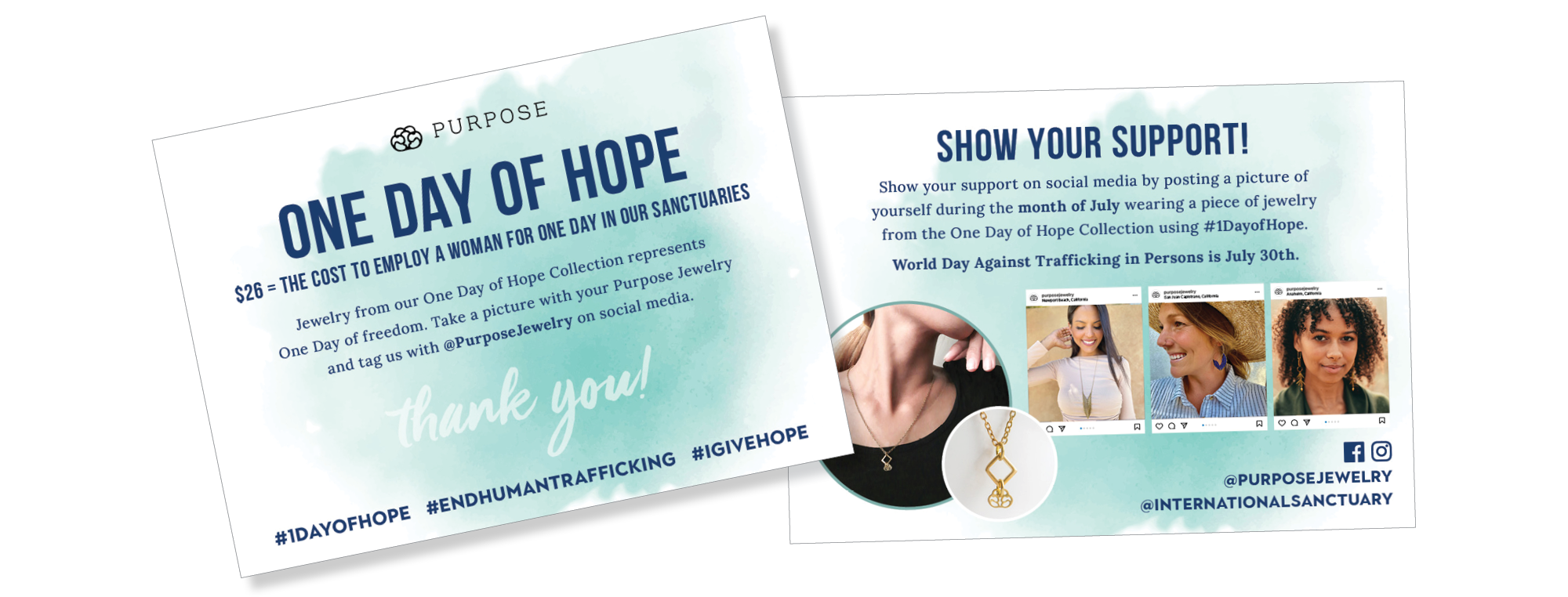
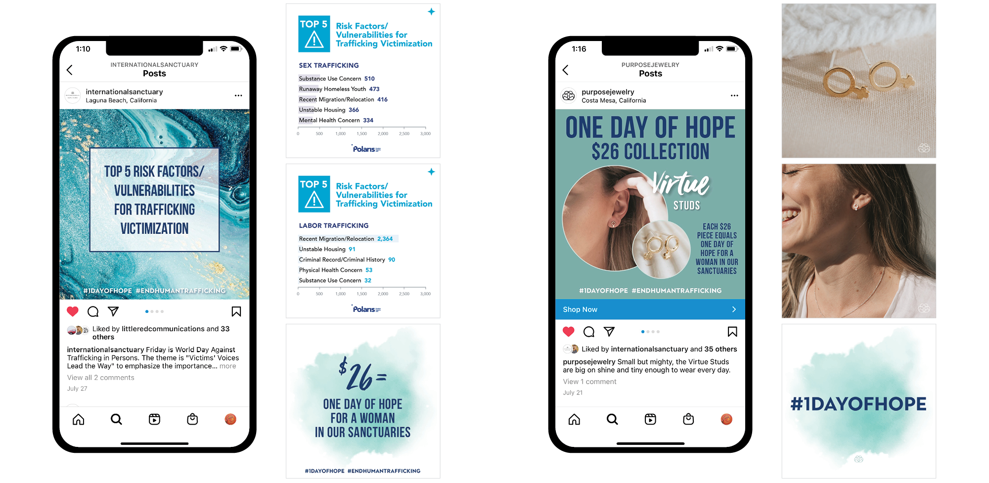
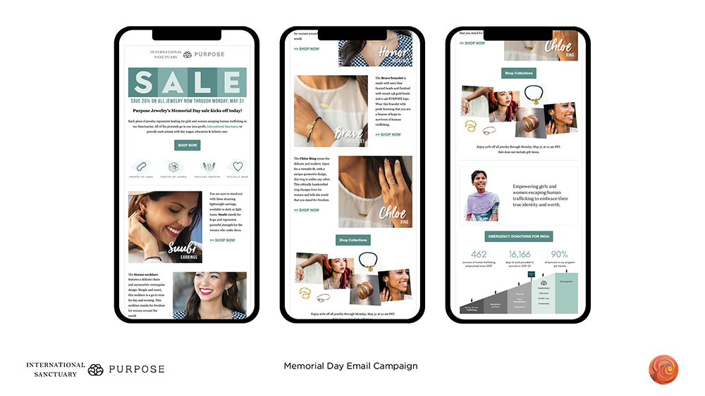
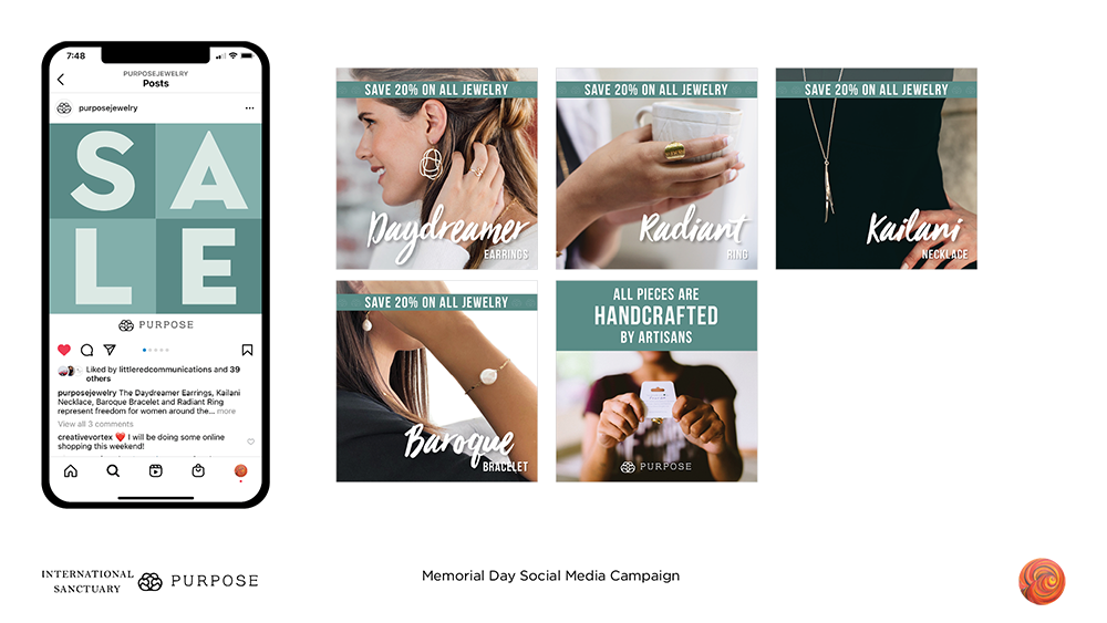
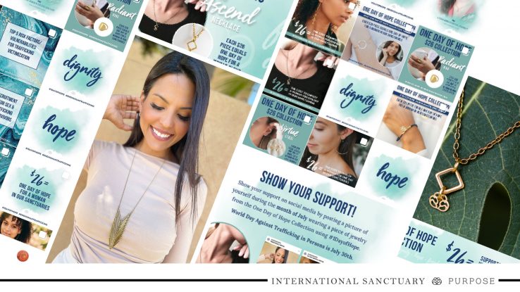
International Sanctuary is a nonprofit focused on empowering girls and women escaping human trafficking through its worldwide sanctuaries and social enterprise Purpose Jewelry. The organization ran a One Day of Hope Campaign in July 2021 in support of World Day Against Trafficking in Persons on July 30, as well as to boost sales of the specially curated One Day of Hope Collection.

Creative Vortex worked in partnership with Little Red Communications to grow awareness of the campaign and boost jewelry sales through targeted social media and hashtags, an email campaign, and customized website elements. The campaign centered around the following:

  • Jewelry in the One Day of Hope Collection costing $26, which is the same amount it takes to support one woman a day in their sanctuaries
  • The words: Hope, Dignity & Freedom
  • Human trafficking information and statistics

APPROACH

Social Media:
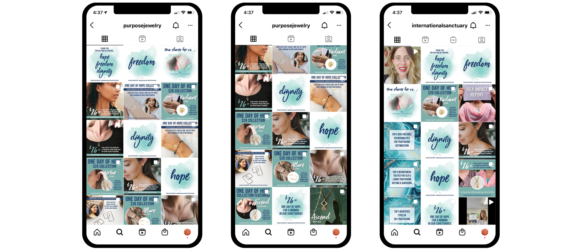
Created a 30-day social media and hashtag strategy with 60+ images highlighting pieces from the One Day of Hope Collection, along with targeted messaging about human trafficking and the organization’s mission. Included posts, stories and hashtags.

Email Campaign:
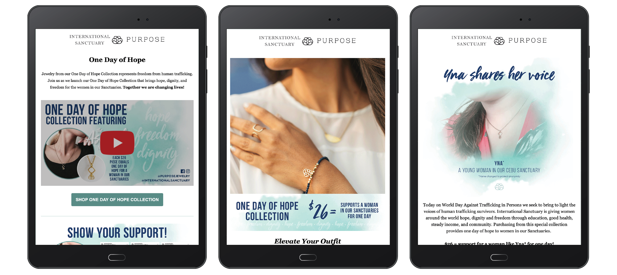
Developed a weekly newsletter highlighting specific pieces from the One Day of Hope Collection and targeted messaging about human trafficking and the organization’s mission.

Website:
Designed customized website elements highlighting the One Day of Hope campaign and its key messages.

Branding:
Developed a comprehensive and distinctive brand, including colors, font, logo placement and language to not only marry the campaign to International Sanctuary and Purpose Jewelry, but to also set it apart.


RESULTS

Sales:

  • Raised more than $23,000 and provided over 910 Days of Hope!
  • Online Store Sessions = 11,969 / Visitors = 11,017 (increase of 14%)
  • Total orders = 174 (increase of 4%)
  • Returning Customer Rate = increase of 31%
  • $467 in donations from the Purpose Jewelry website shopping cart check out TipGenius widget
  • $2,186 sales attributed to email marketing (increase of 60%)
  • $508 in direct social media sales (Facebook increased by 326%)

Sales by Traffic Source:
Direct = $20,716
Search = $2,302
Unknown = $716
Social = $508

Top Referrers by Sessions:
linktr.ee = 155 (increase of 244%)
www.internationalsanctuary.com = 113 (increase of 13%)

Online Store Session by Social:
Facebook = 134 (increase of 148%)
Instagram = 37 (increase of 42%)

Online Store Sessions by Device Type:
Mobile = 7,096 (increase of 19%)
Desktop = 4,399 (increase of 7%)
Other= 279 (increase of 7%)
Tablet = 194 (increase of 38%)

Social Media:
@PurposeJewelry / 22 Posts
+8.7% Increased Content Interactions (998 likes, 37 comments, 30 saves, and 18 shares)
+1.7% New Accounts Reached
+125 New Followers

@InternationalSanctuary / 15 Posts
+144% Increased Content Interactions (341 likes, 15 comments, 6 saves, and 3 shares)
+80.1% Increased New Accounts Reached
+38 New Followers

Email Marketing:
Number of emails in campaign: 6 (with resends to those who did not open = 12)
Average open rate: 12%
Average click rate: 0.5%


Contact Creative Vortex for assistance in launching your next multi-platform marketing campaign! Learn more about us at creative-vortex.com or check us out on Instagram and Facebook.


Digital Marketing Best Practices for Nonprofits

Nonprofit marketing teams are constantly being asked to do more with less. Resources are tight and teams are small. People have good intentions but are wearing multiple hats. Branding and marketing often fall to those that don’t have the expertise and time to do it right. I have spent a significant amount of my career providing branding and marketing for nonprofits and have witnessed this very thing. A plush marketing budget is nice, but not necessary to create an effective branding footprint, especially when it comes to a digital presence. Oftentimes, this is where nonprofits tend to struggle the most because they don’t have a clear understanding when it comes to creating and maintaining it.

Let’s focus on leveraging email campaigns and social media to help nonprofits create a digital presence. Both of these platforms have the ability to reach target audiences, tell a visual story, and provide access points to the organization. The goal is to amplify a mission statement, raise donations/awareness, draw volunteers, and increase the reach of the organization.

Branding Footprint
The overarching goal of a branding footprint is for all of an organization’s collateral to match. This includes a logo, website, social media, business cards, messaging, packaging … literally everything that represents your organization internally and externally. This conveys trust and credibility that the organization is well run and organized, as well as that the employees serving as stewards of the funds raised, will follow through on the organizations brand promise of serving those in need.

Digital Presence
A digital presence needs to fall tightly in line with the rest of the marketing materials and include consistent visuals and messaging seen online. Email marketing and social media are two effective tools available to create an enhanced brand experience online.

Email Marketing
Creating email campaigns allows organizations to segment and target the different people in their audiences. For example, you can focus on volunteers, donors, corporate partners, consumers, or peers. The key to success is to have clear messaging (what do you want them to know or do? What is the CTA?) that utilizes the same language and design elements across all the marketing platforms. It is easy to integrate video and drive people to a similarly branded organization website. Email marketing tends to be more formal and precise.

Social Media
Social media is an amazing opportunity to engage with followers and connect with people new to the brand. It provides an incredible opportunity to tell and show stories about the organization. To truly be impactful, it’s important to create a visual flow that incorporates the same design elements and messaging but allows for the ability to create a unique spin through video, animated gifs, guest appearances, tagging and design templates.

Create a branding guide (i.e. rules for use of logo, colors, fonts) and editorials calendars and stick to it. Remember, you don’t need a big budget to create a plan. Consistency is your key to success with both tools!

4 Red Flags That Signal Your Branding is Struggling

The keystones to building a business that can stand the test of time is creating a brand that people love and have a great buying relationship with. The strength of a brand can be found in its ability to create truly great products and seamlessly connect and communicate with its audience. Brands can start to struggle when they fail to evolve with industry trends and customer needs, or they react too quickly and make hasty decisions individually. Addressing those gaps early on is important to ensure business continuity. Below are four red flags that might signify that your brand is struggling to be relevant.

1. Brand Essence is Confusing

If you can’t quickly and efficiently state what your brand stands for then you have a problem. For example, Amazon is focused on convenience, Walmart on affordable products, Whole Foods on organic food and Starbucks on exceptional coffee. If you don’t know what your brand essence is (i.e. single intangible attribute), or senior management can’t agree on it, then it’s next to impossible to communicate your competitive differentiator to potential customers.

2. Mixed Messages

Are all your marketing and brand platforms communicating the same thing? Do they have the same look and feel? If going to your organization’s website is a different experience than going to your Instagram account that is a clear sign that your brand needs to be realigned. Each platform is used for a different purpose, but they all need to communicate the same brand messages and support the same type of design and imagery.

3. Your Colors Don’t Represent Your Identity

I once had a client that wanted to use cotton candy pink as the main color for a law firm’s brand because it was her favorite color. There isn’t anything wrong with cotton candy pink, however, it is not a color that typically instills confidence in people looking for some legal help to settle some serious issues. Colors greatly affect people’s emotional reaction to a brand and its products or services. It’s been proven that color influences 60 to 80 percent of purchasing decisions. What does your brand color palette say about you?

4. You DIYed EVERYTHING

Let’s be real here. You are probably really good at creating the product or service that your brand was created to sell. But are you good at building a website, designing a logo, writing marketing content or coordinating print jobs? Probably not! Maybe you might save a few dollars by trying to do it all but in the end your brand is going to be more organized, clearer and targeted if you work with professionals that have the expertise and the time to do it right.

Brand misalignment happens to every business at some point. It isn’t a permanent state of being and can be corrected. The important thing is to be aware of it and take the proper steps to correct it.


3 Tips to Calm Networking Jitters 

We are looking for something when we put on our networking hats and approach a room (perhaps right now it’s still a Zoom room!) full of people that we are hopeful to meet. Maybe you are trying to keep up with business trends in your industry, find a new job, looking for talent to fill an open position, build a client list, make new friends or find the most impactful way to volunteer or give back. Your WHY for networking will always be shifting and evolving, but it’s important not to leave the practice for the moment you need something.  Really, the best time to network is when you are not asking for anything so there is time to grow and cultivate relationships. Perhaps, you will be the one giving for a while before needing to receive from a circle of influence. Think of networking as a marathon and not a sprint. Get in there and get comfortable to find your rhythm and style, but also make sure you aren’t always talking with all the same people.

Networking isn’t always easy, but it is so important to ensure that you have access to opportunities not open to the public. Having a high-functioning network provides valuable behind the scenes insight into different fields, internal perspective on jobs and advice on how to grow professionally. Simply put, networking provides better business opportunities and the perception of increased status.

I have been in business a while and have learned a few things about networking and running a successful boutique graphic design agency. Networking is significantly easier for me now after attending all kinds of events, trade shows, luncheons and dinners, but I had to learn a few tricks when I first started out. Below are three tips that can help you calm the jitters.

Prepare What You Want to Say

No, I don’t mean read from note cards or from notes written on the inside of your hand. However, you can still come prepared with what you want to say. Practice a 10 to 20 second elevator speech about yourself that includes who you are, what your professional background is, and why you are at the event. Networking is about getting to know other people so be prepared to ask questions of other people, including the presenters if the opportunity presents itself. It’s also important to have a general understanding about the subject matter being presented or discussed at the event.

Grow the Conversation

Networking is about connecting people that don’t know each other. A conversation with good flow can always handle more people to keep it interesting. Invite people that you already know into the conversation and introduce them to people you just met or already have a relationship with. This is a great way to make sure that the conversation isn’t just dependent on two people. People are going to expect others to drop in and out of conversations at networking events. It is also important to always offer authentic conversation. Believe it or not, it’s not hard to spot someone that is faking it. Don’t pretend to know something you don’t … and if you don’t ask about it. It’s a great way to stay engaged!

Work the Room

Make a plan to literally work yourself entirely through the room to meet people. Make a circle around the perimeter or interior of the room, or you can work the room diagonally to make an X. Doing this ensures maximum exposure and keeps you from getting stuck in a bubble.

Remember, it’s hard for everyone to walk into a crowded room to network. Remember … when signing up for networking events typically you are excited about it. It’s been proven that the brain and nervous system responds the same to nerves and excitement. So the next time you are networking and the jitters are growing take a deep breath, look around the room and focus on your plan. You got this!

Branding 101: Use of Social Media

Social media can be daunting for a business to successfully execute and maintain! Creative Vortex sat down with Emily from Little Red Communications to talk about how to create social media content and images that stay on brand, engage with consumers and drive sales, as well as find out how to build and maintain a thriving presence. Emily provided some tips on getting started and making sure content stayed in line with business initiatives and goals.

The Importance of a Visual Story on Social Media

Finding a Balance Between Marketing and Making a Personal Connection

How to Make Your Images and Content Appealing to Consumers

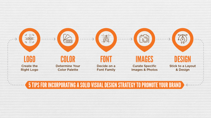
5 Tips for Incorporating a Solid Visual Design Strategy to Promote Your Brand

Visual marketing focuses on using unique and relevant images and design elements, and uses them to pull consumers in. Visual marketing campaigns are more likely to be shared and get clicks than text ads would. As a business, investing in visual marketing is invaluable to your overall strategy. A visual design strategy creates a more consistent experience for your audiences and enhances their engagement with your products and services. According to Brain Rules, people only remember 10 percent of the information they hear, but if that same information is paired with a relevant image 65 percent of the information is retained.

What is a visual design strategy? More than just colors and design, it ties together all the moving pieces that make up your brand, including logo, photos and images, layout and font usage. Brands that put the effort into making sure a visual identity is aligned with key messages and resonates with their audience will more effectively create long-term brand loyalty.

Below are five tips to help create a cohesive visual design strategy, which is an exact reflection of a company. It is so important to put in the time and research into developing the strategy to ensure it accurately and positively represents its brand.

1.    Create the Right Logo

A logo should be unique and provide a snapshot of a brand. It needs to show off a company’s colors and unique attributes. Additionally, it needs to be easily used on many different platforms, including print, social media, digital communications and website. While a logo should be designed to be timeliness, make sure it is consistently updated. Additionally, a logo should have the flexibility to be used with or without a relevant tagline or bug. For those not familiar, a logo bug is a visual element used alongside the copy that can stand alone to represent the brand if necessary.

2.    Determine Your Color Palette

Consistent use of color is the hallmark of well-known brands (think of Coca Cola’s red, Nike’s orange, Google’s multi-colors and Ikea’s blue and yellow). Be sure to do some research into the theory of color to make sure your brand is being properly represented and to make an emotional connection with your audience. You can choose one color or a handful of colors, but make sure they are applied to all of your marketing and communication materials.

3.    Decide on a Font Family

A font needs to support the overall design and brand voice. A really good designer will understand the intricacies of choosing a font based on typography and typeface and can more fully guide you in the process. However, a good font needs to be legible, unique and memorable across a diversity of platforms in order to communicate brand personality. I could talk for days about fonts, typography and typeface … give me a call to learn more!

4.    Curate Specific Images & Photos

The most important thing to know about choosing images and photos is to make sure your target audience can identify with them. You need to create that perfect balance between using stock images and customized photos to illustrate your company. Oh, and don’t forget about mindful copyright laws!

5.    Stick to a Layout & Design

Last, but not least, be sure that your online presence and marketing materials incorporate a consistent layout and design (using your fonts and brand colors, of course) to make sure your brand is easily identifiable and creates brand recognition. How all of the visual elements discussed above flow together and present information about your company and its products/services certainly affects how impactful your marketing and sales efforts are. Layout and design needs to be clean, clear and concise to ensure readability and understanding.

As with all things marketing, make sure that all your different strategies are working together, including messaging, communications, marketing and visuals!

4 Tips To Make Email Work For Your Organization

Email marketing is not dead. In fact, 269 billion emails are sent every day with 90 percent of adults and 74 percent of teenagers using it regularly. However, that number creates a lot of competition for businesses using it to get in front of people.

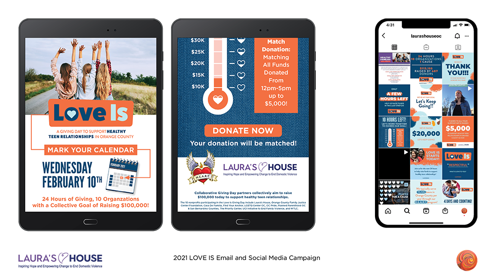
Creative Vortex recently worked with longtime client Laura’s House to create two impactful email marketing campaigns to increase awareness about the organization and support two of its larger donation drives. The 2020 End of Year email campaign raised $85,000 in a little over two weeks and the 2021 LOVE IS campaign raised $30,000 in 24 hours.

Working closely with the team at Laura’s House we were able to create two campaigns that exceeded expectations in regards to audience reach, impact and money raised. Below are our top four takeaways on how to create email marketing campaigns that produce favorable results.

1. Create An Overall Objective 


What do you want the email campaign to do for your organization? Your objective needs to be crystal clear before you start writing or designing the email or your target audience won’t do what you want them to do. Campaign objectives should focus on what you want the people opening the email to do. For example, with Laura’s House year-end appeal and LOVE IS email marketing campaigns we wanted to tell the story of how Laura’s House supports domestic violence victims and teenagers in harmful relationships so that people in our community would donate to the nonprofit. While setting the objective it is also a good time to set a goal to make sure you know what you and your team are working towards. Laura’s House wanted to raise money to benefit their initiatives, but other goals might include wanting to sell products, register attendees for an event, or provide general marketing information.

2. Make it personable and relevant


People are busy and need to know that opening an email is worth the time they put into it. First, catch their eye with a subject line describing the content of the email … and be honest! Nothing puts people off more than using a bait and switch subject line. Once readers open the email get to the point really fast, but make it relevant. Laura’s House year-end email highlighted the fact that they had experienced a 25 percent increase in domestic violence related calls during the pandemic and focused on the impact the pandemic has had on children, families and abusive households and that activity on their 24-Hour Crisis Hotline increased 65 percent. They quickly educated the reader on the increase in demand for services and that their donation would allow this demand to be met. The LOVE IS campaign alerted readers that 93 percent of students that participated in their HEART workshop had increased knowledge about red flags and what makes a healthy relationship, as well as featured a Chapman University study that showed 2 in 3 high school students experience some form of harmful behavior in a relationship.

3. Brand, brand, brand 

I cannot emphasize the branding of the newsletter enough. This means using your logo properly along with a consistent use of colors and visual elements clearly aligned with your organization. If you are a well-known entity this is particularly important for the purpose of brand recognition within your circles of influence. If you are a new or unknown brand this is important to create brand recognition and build credibility with your target audience. Be sure your email provides several links to your website and social media platforms, or whatever page (or pages) is going to help you create results to meet your goals. The email for Laura’s House’s two campaigns were clearly labeled with their logo and brand colors, plus provided links to the donation page on their website in several different places. In fact, the LOVE IS email campaign was actually part of the Collaborative Giving Day fundraising campaign in Orange County, but still focused on its own brand while sharing that space.

4. Timing 


How long should email campaigns last? Timing for each unique campaign is going to vary based on if the emailing marketing is about an event, a sale or fundraiser. Obviously, the Laura’s House email campaigns I have highlighted were for a fundraiser and were different based on the criteria for each event. The year-end campaign lasted two and half weeks and included four emails that were sent to a target audience. We wanted to be strategic about how often we sent these emails out since it was the end of the year and people already had email fatigue from the holidays. They needed to be consistent and visible but not annoying. The LOVE IS campaign lasted 24 hours and included six strategic emails. As mentioned previously, the LOVE IS campaign was part of a bigger fundraising effort for a shorter amount of time and the space was competitive! We need to be really engaged with potential donors and make sure they knew there was a limited amount of time to donate. Email campaigns for events typically include pre-event and post-event information, as well as registration directions. Email campaigns that are consumer-focused typically rotate around announcing new products, sales and general marketing.

This is definitely not a comprehensive list of things to do to create a result-oriented email campaign, but just some highlights! Interested in learning more and how Creative Vortex can help? Reach out via email or phone today.