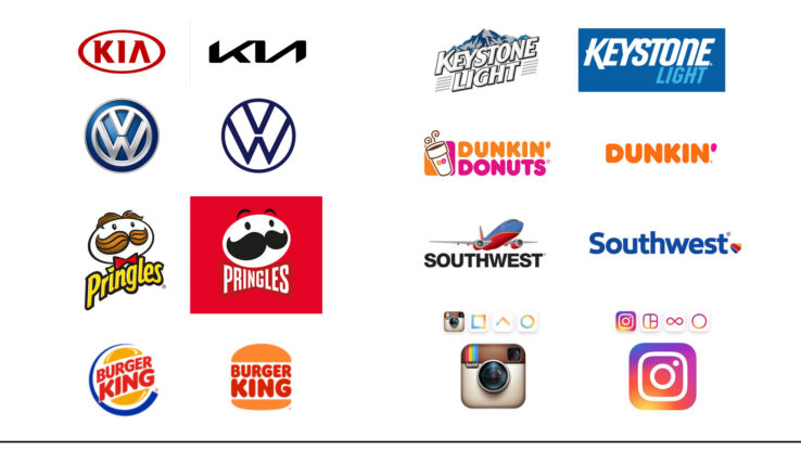
People often get a rebrand and refresh for a brand confused. Or they don’t even know what any of it means. So, they just keep doing what they have always done and eventually start to lose customers because they aren’t offering anything new … or just aren’t reaching people.
Both are centered around a need for change to evolve within a marketplace and stay competitive to a target demographic. A rebrand is a completely new look and feel, while a refresh simply cleans certain elements up but still looks and acts the same.
Change is hard, but necessary! Follow along as we dissect a rebrand and a refresh!
REBRAND
As mentioned previously, a rebrand has a completely new look and feel. It entails changing the following:
- Logo
- Font typeface
- Color Palette
- Tagline
- Key Messaging
- Market Position
- Brand Values
- Brand Guidelines
- Mission & Vision Statement
Be prepared to ask and answer some hard questions from your internal and external audiences. Conduct market research to learn more about how to be competitive within your marketplace and with your chosen audience. What do customers think of your company/brand now? What is your competition doing better than you?
A rebrand will take an investment in time and financial resources to do a thorough job. It is also possible that you might lose some longtime customers because your brand is evolving beyond them. However, if done correctly, your brand will be positioned to stand the test of time and continue to grow for the long-term with the marketplace.
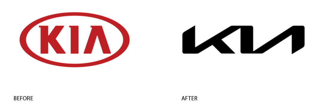
KIA
In 2021, this Korean carmaker decided to go for what’s been called a “dramatically different logo”. The slogan was also changed (now it’s “Movement that inspires”), as well as the company’s name (KIA ditched the word “motors” from the name to show a full-on transition into electric mobility). As the company’s CEO, Ho Sung Song, put it: “Kia’s new logo represents the company’s commitment to becoming an icon for change and innovation.”
(source: https://admindagency.com/blog/rebranding-examples-worth-your-attention/)
REFRESH
A refresh is a simpler process and doesn’t entail changing the core of how a company looks. It typically just includes adaptations to the following:
- Logo
- Font typeface
- Color Palette
- Tagline
- Key Messaging
At the end it still looks and feels like the original design but is smoother and more polished. Typically, there is less of a time and financial obligation, but input from internal and external audiences is still critical to it being successful. Some market research is also a good idea to get aligned with buyer personas and market expectations.
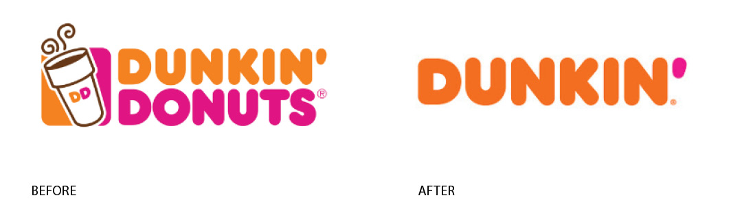
Dunkin Donuts
For its brand refresh, Dunkin’ retained the familiar pink and orange colors and iconic round sans-serif font. However, the brand simplified its name to “Dunkin,” which is how their customers have affectionately referred to the company for years. This name change builds on rapport with their audience and portrays the brand as friendly and familiar. The departure from their previous branding also reflects their expanded menu—the modern Dunkin’ is more than a place to get coffee and donuts.
(source: https://www.yakketyyak.com/brand-refresh-examples/)
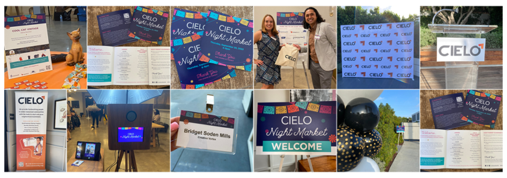
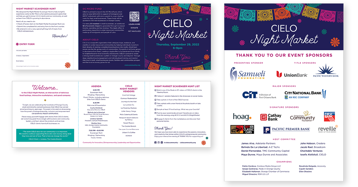
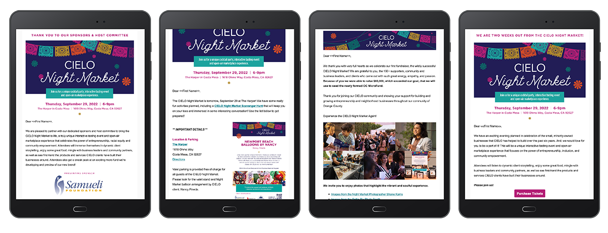
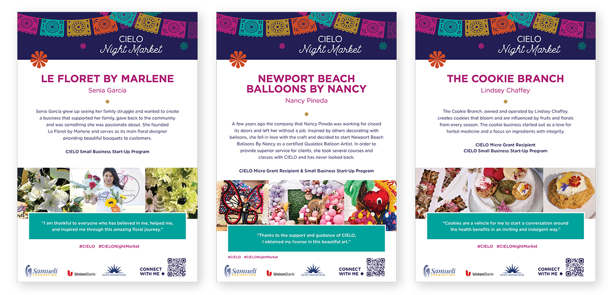
LAUNCHING A REBRAND OR REFRESH
Be strategic about how you launch a new look and feel for your company and make it exciting! Additionally, make them feel like you did this for them (which you did!!). And, most importantly, create a plan that ensures that new look is incorporated across all multi-channel platforms, marketing materials, signage, and key messaging. Tell your customers why you did it, what it means for them, what it means for the company and its products/services.
Looking to take a deeper dive into a rebrand or refresh for your organization? Contact Creative Vortex to schedule a free consultation!