Leveraging a Visual Marketing Strategy

Humans have an incredible ability to remember things far after they have seen it. According to John Medina, author of Brain Rules, if you hear a piece of information three days later, you will remember 10 percent of it. But, by just adding a picture, you will remember 65 percent of it. That being said, design and visual content remains a challenge for content marketers in understanding how to use it in conjunction with content to create relationships with customers. Let’s jump in and explore how visuals are key to creating great customer-brand connections that lead the way to long-term buying loyalty.

Understand Your Target Market 
Your brand’s visuals have a huge impact on what current and potential customers learn and know about your brand, as well as how they engage with it. However, if you don’t know the people in your target market, you can’t properly create the visuals. This isn’t about you, but about THEM  wanting to buy from you, and then telling their friends and family about it. These days people do a lot of research before purchasing and typically end up buying from the brand that is more relatable, even if it might end up costing a little bit more. Once you have a clear understanding of the emotional triggers in your demographic it will be easier to create and use appealing visuals that would make them choose your company over a competitor.

Emotional Appeal 
What do you want consumers to think and feel when they interact with your brand? As mentioned previously, sometimes consumers will spend more on a brand that they can easily relate to and solve their problem. Not only is color and font type important, but photos, images and design elements should play a big part in your brand identity. The visual is going to catch someone’s eye first and then ready the copy to learn more. Food packaging is designed to create an emotional reaction when a hungry person walks by. Instagram images for a yoga apparel brand are designed to make people that practice yoga frequently feel like they can move easily while doing a class. A TV commercial for a tire company is built to create a sense of safe driving for people that live in areas that experience bad weather. It is important to generate an emotional reaction that leads consumers to make purchases.

Beyond the Logo 
There is so much focus on creating a logo in line with a company’s mission and vision statement, that sometimes business owners forget that everything that comes after that needs to align as well. While it is the face of the brand, a logo can only go so far as a design element.  Use the logo as a launching point to develop a website, social media, marketing collateral, advertising, employee headshots and signage that visually works together to tell your company’s story and sells its products/services.

Do the Research
Creating a strong visual brand takes time and you need to be willing to experiment to truly discover what resonates with your customers. Don’t try to create visual elements before understanding what is needed to stand out in crowded market spaces. One of the biggest mistakes brands and their marketing teams make is to create a strategy based on what they think they know about a target audience. Basing the visuals on qualitative and quantitative research will form a strong visual strategy and point your company in the right direction of connecting with the right customers.

Research has shown that 75 percent of consumers are inspired to make purchases based on images and video content that has appealed to their emotional well-being at that moment. Having a well-researched visual marketing strategy aligned with a content strategy, as well as being on brand, has the power to make your company stand above the competition.

Interested in learning more? Contact Creative Vortex today for insights on how we can help your business stand out in a crowd.

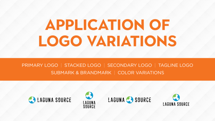
Application of Logo Variations

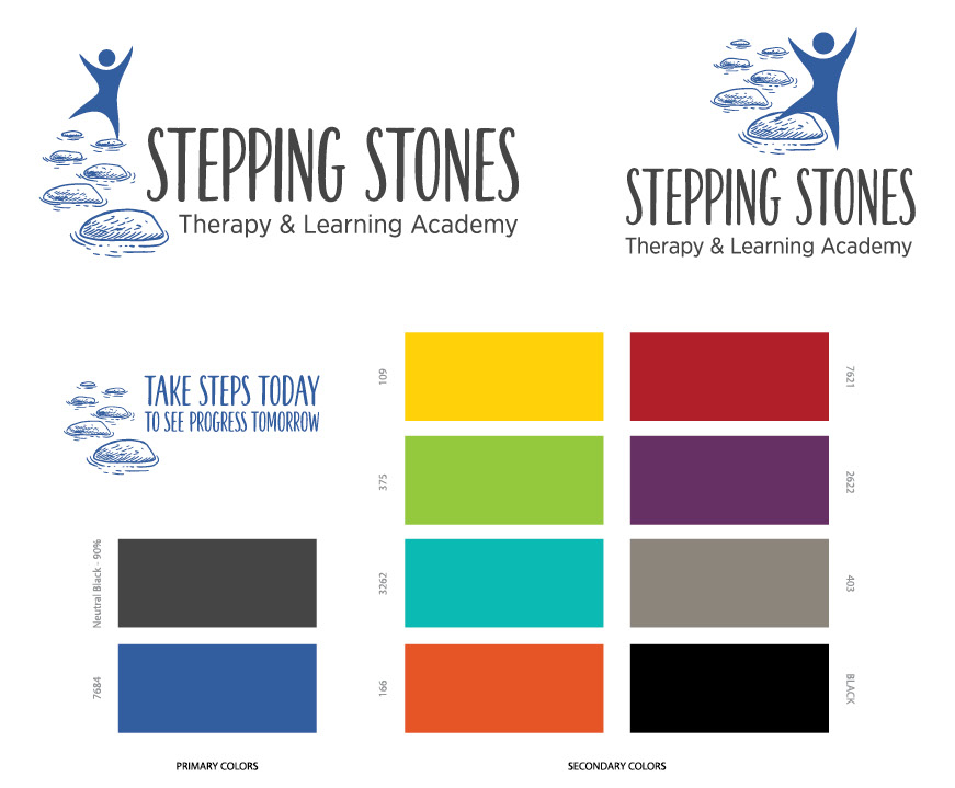
Having a versatile primary logo means having variations of it that can be used in different ways on a variety of platforms. Having several approved logo variations in a branding guide allows a business to shift seamlessly and be recognized instantly. As a business and brand grows, the application of a logo should be adapted to be include on:

1.     Website
2.     Social Media
3.     Print Collateral
4.     Signage
5.     Digital Communications
6.     Apps
7.     Clothes & Bags/Backpacks
8.      Pens, Pencils, etc.

While the primary logo will always be the leading mark of your company, it isn’t always the best application. Logo variations present the best visual aspect of an organization while maintaining brand consistency. Let’s look at the six main types of logo variations.

Primary Logo 

The primary logo is the main identifier of your brand and is used predominantly in your marketing channels and platforms. It sets the tone and should be easily recognized in your target market.

 
Stacked Logo 

Aligned closely with the primary logo, the stacked version should be used when space is tight, typically on printed materials and presentations. If the primary logo is already stacked there is no need to recreate it.


Secondary Logo

Used on as-needed basis and/or to align more closely with the platform it is being used on. It still needs to be tightly knit with the primary logo but can be adapted to be more horizontal/vertical or to show a different side of the company brand.


Tagline Logo

The tagline logo can simply be the primary logo with an approved tagline attached to it. It is important to make sure that when it is used the tagline is legible and easy to read.


Submark & Brandmark 

The submark and brandmark can be used in small spaces and are circular in nature, most notably are used in social media profiles. A submark will include your business name and maybe a tagline. A brandmark is just a graphic element from the primary logo or a monogram of the business name. These items may also be used as watermarks.


Color Variations

While the use of color for all logo types must be maintained, in certain situations to the logo can be adapted in support of environmental or social causes. Choosing logo colors from CMYK or RGB helps to ensure that color consistency is maintained on all marketing platforms. It is also important to determine grayscale versions of the logo types if color options are not available.

How Shapes Affect Logo Design

Shapes are all around us and part of our everyday life. And, whether we believe it or not, they play an important role in building and defining a brand logo that serves as an anchor for an organization in its industry. Shapes in brand logos are often overlooked or misunderstood by business owners with most emphasis being focused on color, font type and format. It is important to give shapes the same amount of attention when creating a logo to:

  • Symbolize different ideas
  • Direct the eye from one element to the next
  • Convey emotion and mood
  • Create trust and professionalism
  • Deliver a sense of depth
  • Connect with an audience

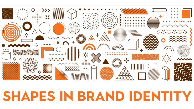
Shape elements, including circles, squares, rectangles, triangles, vertical and horizontal lines, organic shapes and spirals all communicate different meanings. Let’s explore how each element translates in a logo and provides a connection point for current and potential customers.

Circles
A common feature in logo design, circles are used in 20 percent of the most recognized brands. Using a circle in a logo conveys positive emotional messages through unity, friendship, commitment, strength, and steadiness. They connote softness, bonding, consistency, sturdiness, and reliability. In some instances, they imply marriage and partnership to show stability and endurance.

Squares & Rectangles
Another popular and common design form, squares and rectangles create an idea of proportion, balance and dependability. While the corners found in these elements are sharp and abrupt, they also help to inspire trust, safety, maturity, intelligence and strength about the brand for consumers.

Triangles
The triangular shape in logo design shows dynamic power, hierarchy, and continuous motion and/or improvement. The shape of a triangle seems to be pushing in a specific direction which helps to give a perception of brand innovation and resilience. Again, the sharp corners help to emulate trust, safety, maturity, intelligence and strength for consumers

Lines
Lines tend to be the least popular and are often used as a secondary element, but still can significantly impact logo design for the better. Vertical lines can portray strength, sophistication, and, in some instances, aggression. Horizontal lines convey community, tranquility, and calm.

Organic Shapes & Spirals
Not every logo has to be based on circles, squares, rectangles, or triangles. The use of organic shapes, which are naturally occurring forms (shapes), and spirals are often used to create unique logos that are a literal portrayal of a brand. Spirals are used to be centralizing, transformative and are often considered to be hypnotic as well. Organic shapes make people feel warm and comforted by portraying well-recognized elements that tug at heart strings or good memories.

Shapes are building blocks and create patterns, providing something for our brains to memorize and recognize. The use of different shapes, or the use of one strong shape, in logo design can help to create an emotional and psychological bond between a brand and its consumers. It is important to understand how shapes affect your logo and how to incorporate them in order to create a brand connection.

4 Tips To Make Email Work For Your Organization

Email marketing is not dead. In fact, 269 billion emails are sent every day with 90 percent of adults and 74 percent of teenagers using it regularly. However, that number creates a lot of competition for businesses using it to get in front of people.

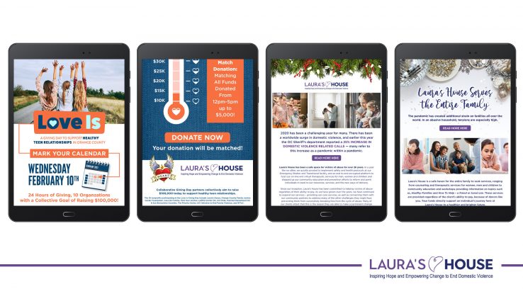
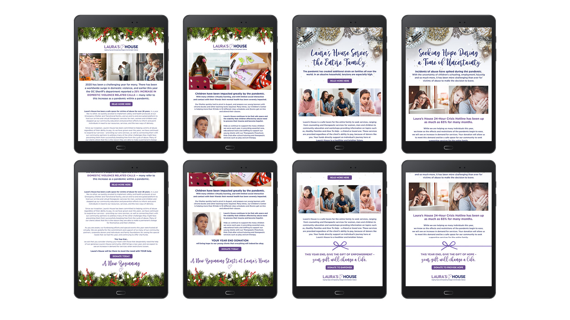
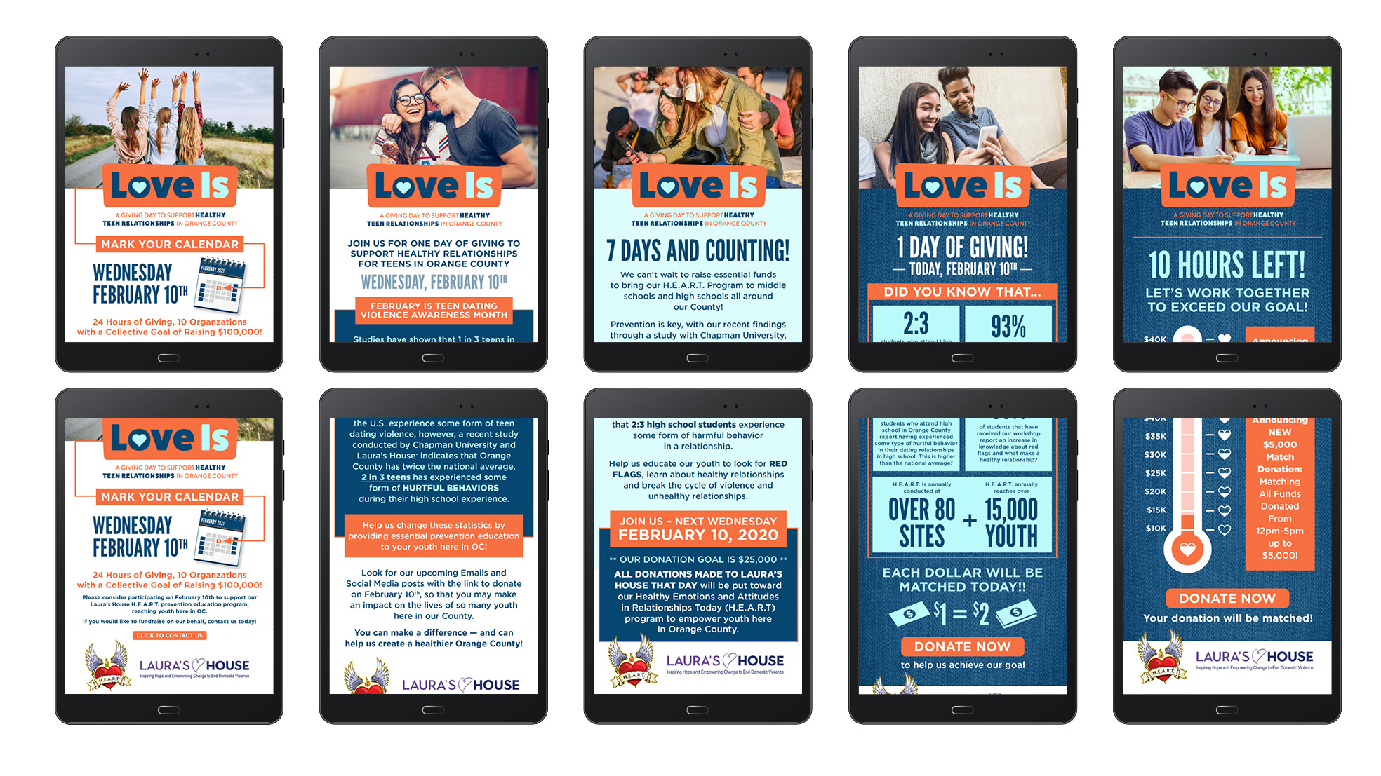
Creative Vortex recently worked with longtime client Laura’s House to create two impactful email marketing campaigns to increase awareness about the organization and support two of its larger donation drives. The 2020 End of Year email campaign raised $85,000 in a little over two weeks and the 2021 LOVE IS campaign raised $30,000 in 24 hours.

Working closely with the team at Laura’s House we were able to create two campaigns that exceeded expectations in regards to audience reach, impact and money raised. Below are our top four takeaways on how to create email marketing campaigns that produce favorable results.

1. Create An Overall Objective 


What do you want the email campaign to do for your organization? Your objective needs to be crystal clear before you start writing or designing the email or your target audience won’t do what you want them to do. Campaign objectives should focus on what you want the people opening the email to do. For example, with Laura’s House year-end appeal and LOVE IS email marketing campaigns we wanted to tell the story of how Laura’s House supports domestic violence victims and teenagers in harmful relationships so that people in our community would donate to the nonprofit. While setting the objective it is also a good time to set a goal to make sure you know what you and your team are working towards. Laura’s House wanted to raise money to benefit their initiatives, but other goals might include wanting to sell products, register attendees for an event, or provide general marketing information.

2. Make it personable and relevant


People are busy and need to know that opening an email is worth the time they put into it. First, catch their eye with a subject line describing the content of the email … and be honest! Nothing puts people off more than using a bait and switch subject line. Once readers open the email get to the point really fast, but make it relevant. Laura’s House year-end email highlighted the fact that they had experienced a 25 percent increase in domestic violence related calls during the pandemic and focused on the impact the pandemic has had on children, families and abusive households and that activity on their 24-Hour Crisis Hotline increased 65 percent. They quickly educated the reader on the increase in demand for services and that their donation would allow this demand to be met. The LOVE IS campaign alerted readers that 93 percent of students that participated in their HEART workshop had increased knowledge about red flags and what makes a healthy relationship, as well as featured a Chapman University study that showed 2 in 3 high school students experience some form of harmful behavior in a relationship.

3. Brand, brand, brand 

I cannot emphasize the branding of the newsletter enough. This means using your logo properly along with a consistent use of colors and visual elements clearly aligned with your organization. If you are a well-known entity this is particularly important for the purpose of brand recognition within your circles of influence. If you are a new or unknown brand this is important to create brand recognition and build credibility with your target audience. Be sure your email provides several links to your website and social media platforms, or whatever page (or pages) is going to help you create results to meet your goals. The email for Laura’s House’s two campaigns were clearly labeled with their logo and brand colors, plus provided links to the donation page on their website in several different places. In fact, the LOVE IS email campaign was actually part of the Collaborative Giving Day fundraising campaign in Orange County, but still focused on its own brand while sharing that space.

4. Timing 


How long should email campaigns last? Timing for each unique campaign is going to vary based on if the emailing marketing is about an event, a sale or fundraiser. Obviously, the Laura’s House email campaigns I have highlighted were for a fundraiser and were different based on the criteria for each event. The year-end campaign lasted two and half weeks and included four emails that were sent to a target audience. We wanted to be strategic about how often we sent these emails out since it was the end of the year and people already had email fatigue from the holidays. They needed to be consistent and visible but not annoying. The LOVE IS campaign lasted 24 hours and included six strategic emails. As mentioned previously, the LOVE IS campaign was part of a bigger fundraising effort for a shorter amount of time and the space was competitive! We need to be really engaged with potential donors and make sure they knew there was a limited amount of time to donate. Email campaigns for events typically include pre-event and post-event information, as well as registration directions. Email campaigns that are consumer-focused typically rotate around announcing new products, sales and general marketing.

This is definitely not a comprehensive list of things to do to create a result-oriented email campaign, but just some highlights! Interested in learning more and how Creative Vortex can help? Reach out via email or phone today.

Online Images and Copyright Issues

Anyone creating and building a business knows the importance of an image to sell a product or service to create brand recognition. Images are used everywhere … websites, blogs, social media, advertisements and emails are just a few. We all know that procuring images to represent a brand is hard and doesn’t come cheap. Graphic design and photography can vary significantly in price, but these services are necessary to create a polished marketing effort. So, it’s not uncommon for people to search the internet for supposedly “free” images. But just because it’s on the internet doesn’t mean it’s free. Copyright laws protect all forms of artistic work.

According to the US Copyright Office, copyright is a form of intellectual property law and protects original works of authorship including literary, dramatic, musical, and artistic works, such as poetry, novels, movies, songs, computer software, and architecture. Placing a copyright on any type of work is automatic and a registration with the US Copyright Office is only necessary if a lawsuit for infringement is brought up. A copyright gives complete control and distribution to the person that created the words, photo or design. The Copyright Act grants five rights to a copyright owner, including the right to:

  1. Reproduce owned (i.e. copyrighted) work.
  2. Prepare edited alternatives of the owned work.
  3. Distribute copies of the work to the public.
  4. Perform the copyrighted work publicly.
  5. Display the copyrighted work publicly.

Finding the Right Images
The fact of the matter is that you can’t just find an image online for use in your marketing efforts to promote a business. Even sourcing images carries its own risk as explicit permission must be granted by the owner.

The most realistic solution is to create your own unique graphics and photos by hiring a graphic designer and/or photographer, but sometimes this just isn’t possible. Other options are to buy stock photos on Getty Images, iStock or ShutterStock, or leverage free stock photos from StockSnap.io, Unsplash, or Flickr. Smartphones come with pretty amazing cameras these days so that you can even take your own photos. The same goes for graphic design. If you don’t have the money to hire a designer Canva, Snappa, or Pablo provide customizable templates for everything from social media to brochures to website design. These platforms even provide a variety of free stock photos and images that can be included in marketing materials.

Although the subject of copyright laws pertaining to images seems like a black and white issue, it can be complicated! Questions? Give me a call.

Three Reasons a Professional Logo Design Will Benefit Your Business 

A logo is an easily identifiable mark of your business and should give a great first impression of a business to clients and customers. In most cases, a brand identity is built around a logo and will carry through on marketing collateral, digital presence and social media. Designing a logo should be taken very seriously and considered in the larger context of your brand identity (i.e. colors, elements and messages) and brand essence (what the brand actually stands for).

Determining the need for a logo is easy but executing the perfect logo for a business is a whole other experience. In most instances, people understand the need and really want an amazing logo but are concerned about cost and time commitment. If you search the internet for logo design results will include a myriad of websites that offer a logo for $38 … even going as low $29. Just insert the name of the business, your favorite color, and industry into a form, click a button and then choose from more 100 logos design that will perfectly match your business. People can walk away with a jpeg file in just minutes. But, can that logo do everything that you need it to do? Was it built to reflect your business identity and customized for use on all the different digital, print and social media platforms available?

Approaching a professional designer can be intimidating for fear of asking a stupid question or being worried about how much the designer will charge. As far I am concerned there are no stupid questions when it comes to my industry. You don’t need to know everything about graphic design … that’s my job, not yours. As for costs, they will vary according to different design agencies or designers but will typically range according to your needs. Most importantly, what is included in those costs is far more comprehensive and the final, customized product will serve as an asset to your marketing and digital goals.

Still not sure? See below for my top three reasons to hire a professional designer.

#1 – Designed Around a Concept and Strategy 

A logo should serve as a foundation for your brand. A professional designer will know how to use the theory of color in multiple or single colors, leverage different design elements and balance typography that circles back to the organization’s mission and business focus. The designer will also know how to incorporate subtle meanings that will set the business apart from the competition.

#2 – Different Formats and Variations 

A professional designer will have the skill to create a responsive design logo that can be used in many different platforms, including signage, advertising, marketing, digital and social media. The designer will be able to provide more than just a jpeg file, but also stacked and vertical options, reversed color, vector and png files (needed for print), and a bug (an element from the logo for profile images).

#3 – Return on Investment 

A strategic and professionally designed logo will grow with your business and stand the test of time. It will give your brand credibility and strength to become a well-recognized image of your business, which will ultimately attract new clients and retain current customers.

It’s important for businesses of all sizes to have a strong, identifiable logo that ties together a brand identity and unifies a business presence in all places it is leveraged. Working with a professional designer is a bigger investment of financial resources and time in the beginning, but in the end will serve your business well into the future.

My shameless plug … please reach out at bridget@creative-vortex.com to get started with creating a new logo or refresh the one you already have!