Visual marketing focuses on using unique and relevant images and design elements, and uses them to pull consumers in. Visual marketing campaigns are more likely to be shared and get clicks than text ads would. As a business, investing in visual marketing is invaluable to your overall strategy. A visual design strategy creates a more consistent experience for your audiences and enhances their engagement with your products and services. According to Brain Rules, people only remember 10 percent of the information they hear, but if that same information is paired with a relevant image 65 percent of the information is retained.
What is a visual design strategy? More than just colors and design, it ties together all the moving pieces that make up your brand, including logo, photos and images, layout and font usage. Brands that put the effort into making sure a visual identity is aligned with key messages and resonates with their audience will more effectively create long-term brand loyalty.
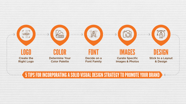
Below are five tips to help create a cohesive visual design strategy, which is an exact reflection of a company. It is so important to put in the time and research into developing the strategy to ensure it accurately and positively represents its brand.
1. Create the Right Logo
A logo should be unique and provide a snapshot of a brand. It needs to show off a company’s colors and unique attributes. Additionally, it needs to be easily used on many different platforms, including print, social media, digital communications and website. While a logo should be designed to be timeliness, make sure it is consistently updated. Additionally, a logo should have the flexibility to be used with or without a relevant tagline or bug. For those not familiar, a logo bug is a visual element used alongside the copy that can stand alone to represent the brand if necessary.
2. Determine Your Color Palette
Consistent use of color is the hallmark of well-known brands (think of Coca Cola’s red, Nike’s orange, Google’s multi-colors and Ikea’s blue and yellow). Be sure to do some research into the theory of color to make sure your brand is being properly represented and to make an emotional connection with your audience. You can choose one color or a handful of colors, but make sure they are applied to all of your marketing and communication materials.
3. Decide on a Font Family
A font needs to support the overall design and brand voice. A really good designer will understand the intricacies of choosing a font based on typography and typeface and can more fully guide you in the process. However, a good font needs to be legible, unique and memorable across a diversity of platforms in order to communicate brand personality. I could talk for days about fonts, typography and typeface … give me a call to learn more!
4. Curate Specific Images & Photos
The most important thing to know about choosing images and photos is to make sure your target audience can identify with them. You need to create that perfect balance between using stock images and customized photos to illustrate your company. Oh, and don’t forget about mindful copyright laws!
5. Stick to a Layout & Design
Last, but not least, be sure that your online presence and marketing materials incorporate a consistent layout and design (using your fonts and brand colors, of course) to make sure your brand is easily identifiable and creates brand recognition. How all of the visual elements discussed above flow together and present information about your company and its products/services certainly affects how impactful your marketing and sales efforts are. Layout and design needs to be clean, clear and concise to ensure readability and understanding.
As with all things marketing, make sure that all your different strategies are working together, including messaging, communications, marketing and visuals!