Mastering Branding for Start-Ups

One of the most daunting challenges of launching a business is building its brand from the ground up. You may find yourself asking, “Where do I start?” and “How do I develop the right identity?” The process can feel overwhelming, but by breaking it down into manageable steps — like defining your brand’s purpose, understanding your audience, and crafting a unique value proposition — you can create a strong foundation.

Developing the right brand identity is about aligning your visual elements, voice, and messaging with your core values and audience needs. Though it takes time and patience, each step you take brings you closer to establishing a brand that resonates and thrives in the market.

1. Define Your Brand Purpose and Values
Start by understanding your “why.” Why does your business exist, and what values drive it? This clarity will shape your brand’s mission and resonate with your target audience.

2. Know Your Audience
Research your target market to understand their needs, preferences, and pain points. Tailor your brand message and identity to appeal directly to them.

3. Craft A Unique Value Proposition
Identify what makes your product or service unique. Your value proposition should clearly communicate the benefits your brand offers and why customers should choose you over competitors.

4. Develop A Visual Identity
Your logo, color scheme, typography, and overall visual style should reflect your brand’s personality. Consistency across all platforms is key to building brand recognition.

5. Develop A Strong Brand Voice
Your brand voice should align with your values and resonate with your audience. Whether it’s professional, casual, or quirky, consistency in tone helps build trust and familiarity.

Building a strong brand takes time. Stay committed to your brand strategy, and over time, your efforts will pay off as your brand identity becomes established in the market. By focusing on these strategies, startups can lay a solid foundation for a brand that not only stands out but also grows stronger over time.

The Shift to Digital-First Branding

In today’s ever-evolving business landscape, the concept of digital-first branding has emerged as a fundamental strategy for success. This approach places paramount importance on digital elements in shaping the identity and trajectory of a brand. Essentially, digital-first branding ensures that every aspect of a customer’s interaction with the brand—be it the experience, aesthetics, messaging, or engagement—is seamlessly synchronized across various digital touchpoints.

Embracing a digital-first branding strategy is no longer merely a choice; it has become essential in today’s business environment. It recognizes that in an increasingly digitized world, the way customers perceive and engage with a brand online plays a pivotal role in shaping their perception and loyalty. With consumers spending more time online than ever before, brands must prioritize their digital presence to remain relevant and competitive.

Here are some important reasons why businesses need to prioritize digital-first marketing:

Targeted Campaigns:

Digital-first marketing empowers businesses to create highly targeted campaigns that resonate with their audience on a personal level. Unlike traditional marketing approaches, digital platforms allow for precise segmentation of audiences based on demographics, purchasing history, and other relevant factors. For instance, businesses can segment their email lists and customize marketing emails with tailored content, offers, language, and imagery to better appeal to different customer segments. This level of personalization enhances engagement and drives better results.

Enhanced Customer Experience:

Consumers today expect brands to be responsive and accessible on digital platforms. A digital-first approach to branding enables businesses to meet these expectations by providing timely and efficient customer support. Research shows that 71% of consumers aged 16 to 24 believe that a quick response from a service team significantly enhances their experience. Moreover, failing to respond promptly to customer inquiries on social media platforms can have detrimental effects, with half of the customers indicating they would not engage with the brand again. By prioritizing digital channels for customer interaction and support, businesses can improve satisfaction levels and foster loyalty.

Increased Flexibility:

Digital-first branding offers businesses greater adaptability in responding to evolving market trends and consumer behaviors. In a rapidly changing technological landscape, businesses need to stay agile and responsive to stay ahead of the competition. Digital platforms provide real-time analytics and insights, allowing businesses to monitor campaign performance and make data-driven decisions quickly. This agility enables businesses to adjust their strategies in real-time, optimizing marketing efforts for maximum impact. By embracing a digital-first approach, businesses can stay nimble and effectively navigate the ever-changing digital landscape.

Unlike traditional marketing channels, digital platforms offer real-time analytics and insights that enable brands to measure the effectiveness of their campaigns and make data-driven decisions. This agility is invaluable in today’s fast-paced environment, where consumer preferences and market dynamics can shift in an instant.
By leveraging digital platforms effectively, businesses can establish a strong online presence, engage with their audience on a personal level, and stay ahead of the curve in today’s competitive market. Embracing digital-first branding is not just about keeping up with the times—it’s about setting the stage for long-term success in the digital age.

Creative Vortex is a strategic graphic design partner for passionate people in a wide variety of industries who own the power of their WHY. Book a free consultation today.

Using Visual Assets on Social Media for Better Engagement

Visual content on social media matters. According to Hootsuite, LinkedIn posts with images have a 98% higher comment rate and Twitter tweets with visual content are three times more likely to get engagement. And, on Instagram the more visual content the higher the engagement. According to 2022 Statista data, the average engagement rate for an Instagram post on a business page is 1.94% and carousel posts have a higher engagement rate of 3.15%.

Plus, the type of visual makes a big difference for marketers and consumers with a big focus on high-quality video and images. Hootsuite reports that 47% of adults like to see content in the form of images. 35% said they like to see brand content in video form, as found from a 2021 Swedish study conducted by Statista.

Different types of visual content on social media include:

  • Photos
  • Videos
  • Carousel posts (multiple photos or videos)
  • GIFs
  • Illustrations
  • Infographics
  • Animations
  • Memes

Below are my top four tips for incorporating visuals into your brand and social media strategy.

1. Color Palette

Create a color palette that represents your brand and follow it all the way through your feed. Not only does it develop a stunning look, but it creates brand recognition and connection with all your followers. Make sure to alternate how you use color by creating different templates, as well as pictures and video.

2. High Quality Assets

Use high quality assets that have the right specifications for each platform, so they can display without being stretched out or pixelated. When using a link to fill in an image make sure that what is being displayed is accurate and tells the right story. Lastly, when posting a video be sure to choose the thumbnail that is represented in the feed when it isn’t playing.

3. Image Copyrights

It is so important to give credit where it is due. If you didn’t create, film or buy your image/video be sure to highlight and/or tag the person or organization that did. Other than it being basic courtesy, there are legalities surrounding using an image or video from other creators that isn’t from a free stock image site.

4. Brand Your Content

Don’t be afraid to leverage your brand logo with your images.  However, don’t overuse it or let it take up too much space. Use it enough to create recognition and to ensure you get proper credit when people repost.

In closing, we encourage you to pay close attention to social media trends. Social media platforms tend to reward handles with higher engagement when they are leveraging the latest practices. Also, use a scheduler to manage your social media strategy! The surest way to fail at this is to not plan out content!

There is so much to know about social media! Want to learn more? Reach out and schedule a free 30-minute consultation today.


Brand Refresh & Rebrand: Understanding The Difference

People often get a rebrand and refresh for a brand confused. Or they don’t even know what any of it means. So, they just keep doing what they have always done and eventually start to lose customers because they aren’t offering anything new … or just aren’t reaching people.

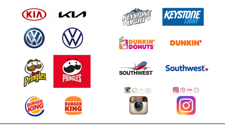
Both are centered around a need for change to evolve within a marketplace and stay competitive to a target demographic. A rebrand is a completely new look and feel, while a refresh simply cleans certain elements up but still looks and acts the same.

Change is hard, but necessary! Follow along as we dissect a rebrand and a refresh!

REBRAND

As mentioned previously, a rebrand has a completely new look and feel. It entails changing the following:

  • Logo
  • Font typeface
  • Color Palette
  • Tagline
  • Key Messaging
  • Market Position
  • Brand Values
  • Brand Guidelines
  • Mission & Vision Statement

Be prepared to ask and answer some hard questions from your internal and external audiences. Conduct market research to learn more about how to be competitive within your marketplace and with your chosen audience. What do customers think of your company/brand now? What is your competition doing better than you?

A rebrand will take an investment in time and financial resources to do a thorough job. It is also possible that you might lose some longtime customers because your brand is evolving beyond them. However, if done correctly, your brand will be positioned to stand the test of time and continue to grow for the long-term with the marketplace.

KIA

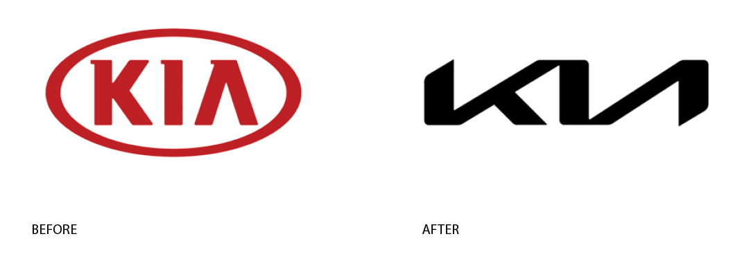
In 2021, this Korean carmaker decided to go for what’s been called a “dramatically different logo”. The slogan was also changed (now it’s “Movement that inspires”), as well as the company’s name (KIA ditched the word “motors” from the name to show a full-on transition into electric mobility). As the company’s CEO, Ho Sung Song, put it: “Kia’s new logo represents the company’s commitment to becoming an icon for change and innovation.”

(source: https://admindagency.com/blog/rebranding-examples-worth-your-attention/)

REFRESH

A refresh is a simpler process and doesn’t entail changing the core of how a company looks. It typically just includes adaptations to the following:

  • Logo
  • Font typeface
  • Color Palette
  • Tagline
  • Key Messaging

At the end it still looks and feels like the original design but is smoother and more polished. Typically, there is less of a time and financial obligation, but input from internal and external audiences is still critical to it being successful. Some market research is also a good idea to get aligned with buyer personas and market expectations.

Dunkin Donuts

For its brand refresh, Dunkin’ retained the familiar pink and orange colors and iconic round sans-serif font. However, the brand simplified its name to “Dunkin,” which is how their customers have affectionately referred to the company for years. This name change builds on rapport with their audience and portrays the brand as friendly and familiar. The departure from their previous branding also reflects their expanded menu—the modern Dunkin’ is more than a place to get coffee and donuts.

(source: https://www.yakketyyak.com/brand-refresh-examples/)

LAUNCHING A REBRAND OR REFRESH

Be strategic about how you launch a new look and feel for your company and make it exciting! Additionally, make them feel like you did this for them (which you did!!). And, most importantly, create a plan that ensures that new look is incorporated across all multi-channel platforms, marketing materials, signage, and key messaging. Tell your customers why you did it, what it means for them, what it means for the company and its products/services.

Looking to take a deeper dive into a rebrand or refresh for your organization? Contact Creative Vortex to schedule a free consultation!

Settle Into Your Zone of Genius

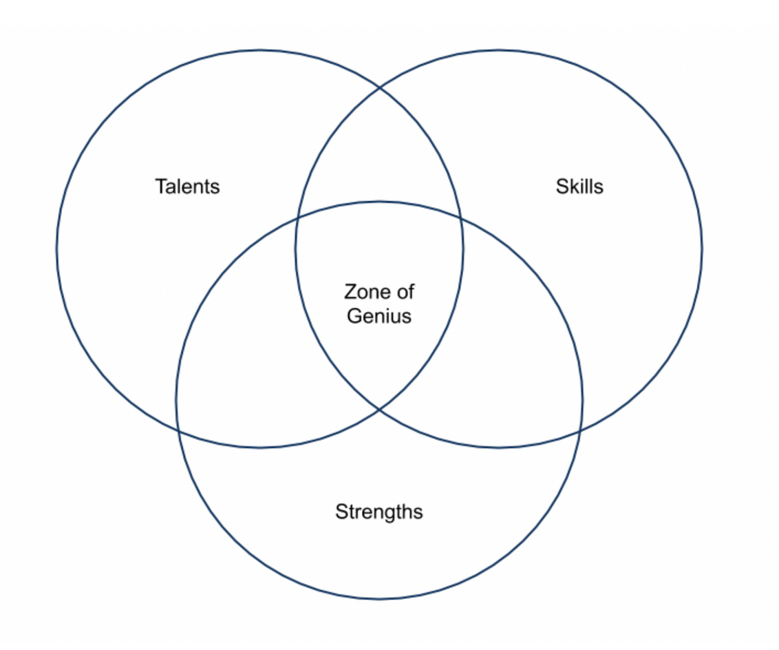
Ever get a feeling of energy and flow that is effortless when performing a task or activity? I am talking about pure Zen! That is a Zone of Genius and it is your own unique power. It can be described as the sweet spot between skills, strength and talents.  Most times, this is where entrepreneurs and small business owners are at and the reason they went into business in the first place. It is the passion that drove them to set out on their own and create a product or service that nobody else could!


What does this all mean? The activities you participate in typically fall within one of four zones:

  1. Zone of Incompetence – things other people can do better than you
  2. Zone of Competence – Things you can accomplish and other can do too
  3. Zone of Excellence – Things you can do better than others, but you don’t enjoy it
  4. Zone of Genius – Things that you are uniquely good at and thoroughly enjoy doing

As someone inspired to start and run your own company, it is important to recognize where your Zone of Genius lies and when you start to drift into incompetence, competence, and excellence. What are the activities that you are spending your time doing that you aren’t very good at or are not enjoying? Could someone else be doing it better? Finding the right workflow means understanding what you want, what you are good at and what the organizations needs to grow and thrive.

Working in your Zone of Genius is all about finding joy and energy in a task. Anything that falls outside of that in Zones 1 – 3 needs to be considered carefully and then outsourced to people that find purpose in the job. The task could be overhauled or even eliminated. The Zone of Excellence can be tricky because you will do it well but not enjoy it. This is exactly how people end up in jobs they hate for 20+ years! Be transparent about how you feel about tasks and responsibilities … to yourself and to the people around you.

What is the best way to realize our Zone of Genius? Consider leveraging these exercises:

  1. Monitor work related tasks for a set period … two weeks is usually a good baseline
  2. Put each task into the Zones 1 – 4
  3. Tally up what went into each Zone

This is the fun part! For all the tasks that went into Zone 1 – 3 figure out ways to either eliminate (most of the time it is not feasible to completely eliminate a task, but it is possible periodically!), outsource it or rework the task to make it enjoyable.

Understanding your Zone of Genius means embracing your natural talent, which often can go ignored because you feel pressured to “like” another job or task better, a negative and subjective work evaluation or simply because you are overwhelmed trying to be everything to everyone.

Want to learn more about finding your Zone of Genius? Check out this YouTube video!

Disruptive Branding

“The customer is always right”

This is what drives brands to look beyond the status quo and shake up the marketspace through innovation and disruption to reach new customers. A truly disruptive brand works to consistently develop products and services and marketing methods that rise above the noise.

What Is It Exactly?

Being a brand disruptor is not just about doing something differently. It is about actually changing the game. To make an idea (whether it be a new idea or a reinvented process) or a marketing process truly disruptive it needs to be so significantly better that it completely shifts how people think and steers the market in a new direction. AirBNB and Uber are great examples of this. Not only did these companies give people an opportunity to make money but they made it easier for customers to go and stay places cost effectively.

Key to Success

Pulling off a successful disruption is a perfect mix of market research and risk. It is important to understand the following:

  • Customer experience gaps
  • Insight into customer journeys
  • Current brand perception
  • Consumer market research and data analysis
  • Scope of threat from competition
  • Competitive pricing structure
  • Customer engagement strategies

Be sure to determine the unique customer benefits and experience for customers. Is it really going to disrupt the marketplace or potentially completely miss the mark and damage your brand reputation?

Customer Technology

Consumers relationships with brands are driven by technology, whether it be through social media, websites, digital advertising, or apps. These customer experiences are more interactive, discernable, and reactive given the accessibility and ease of technology. This provides brands the opportunities to learn more about what their customers need and want, along with how they want to be engaged by a business. It also gives them ease of access to what their competition is doing.

The technology also allows brands to conduct market research and test strategies that allows them to find market anomalies and hone in on what could serve as the greatest disruptor for the consumer and marketplace.

How to Be a Disruptor

To be a great brand disruptor, think big! Think about an innovation that seems impossible but then do the research to back it up. Maybe it is about creating a product or a service. Or maybe it is simple about how a marketing and/or advertising campaign is executed to get in front of people and create a positive memorable impression.  At the end of the day being a disruptive brand is all about the belief that customer experience needs to change. Remember, the customer is always right!

Know Where Your Genius Lives

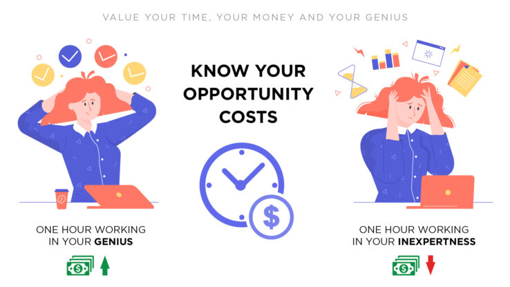
Every decision we make carries an opportunity cost. If we don’t budget our time wisely, we end up wasting it, as well as our energy on things that don’t matter or should be delegated to those with the proper expertise. For example, when I first started my business, I thought I needed to handle my monthly accounting, data entry and P&L statements. I spent HOURS trying to understand and organize the money I was making and spending. What I quickly learned was that the amount of time I was spending on this task each month was significantly taking away the time I spent on client work which ended up causing me some very late-night hours and a lot of stress. The obvious lesson I learned here was that I needed to outsource this task to an expert that manages this more efficiently so that I could focus on building a graphic design and branding business.

Fifteen years later the term “stay in your lane” resonates loudly with me as I seek to create synergies with third parties that can help me run Creative Vortex more efficiently. That’s not to say that learning a new skill or gaining an appreciation for another talent isn’t still important but knowing where your genius lives and honoring that is equally, if not more so, important.

This concept also applies to creating a marketing and design strategy for a business. It is amazing to me how often people think they can do this themselves because they “know their business the best” and consider themselves to be creative or a great writer. Or they simply just don’t see the value in investing in a professional design team because they think that an online software can give them everything they need for $150 a year. Then waste hours of their own time trying to do something they are not very good at and struggle with the execution.

The examples below are the most common:

  • Working solo to customize marketing materials from a template to save money vs hiring experts with proven experience to increase sales and company revenue and hit deadlines.
  • Posting on social media sporadically with content that has no meaning to the target market (you think it does, but it is totally off base) vs hiring a professional to do some market research and create a strategy and content calendar that has relevance with your audience.
  • Paying for online ads and using stock visuals (or worse yet, visuals stolen from the Internet) vs hiring a professional digital marketer/designer to create custom visuals and assist with ad copy.
  • Paying a lot of money for a booth spot at a trade show, waiting too long to create the design/marketing and end up missing the mark because they didn’t know about the many, many details related to printing, shipping, set-up and execution.
  • Buying a discount logo online and expecting it to work for all your marketing and business needs. Please know that putting a vertical logo into a horizontal space isn’t going to work because it is so small that people can’t see it. Just because you can get a logo for $99 in a day doesn’t mean you should. Your brand mark should have the ability to shine in all its applications.

How much is your time actually worth? How much time in your day are you spending on tasks you don’t understand and consequently getting poor results for your effort? Think about how much more you could achieve and build your business by partnering with a creative/marketing professional that could help strategically guide your business and ultimately save you time and money. Branding is a process and it is important to build the foundation, which typically includes business name, tagline, mission and vision statement.

Every day we are faced with choices on how to invest our time, and we all can be guilty of the same thing: Taking on too much without properly understanding the costs. Especially when it comes to marketing and design, it is important to partner with experts that know how to create the most impact for your money, no matter how big or small a budget is.

Interested in learning more about creating a branding and marketing strategy? Contact Creative Vortex today for insights on how we can help your business stand out in a crowd.

How Shapes Affect Logo Design

Shapes are all around us and part of our everyday life. And, whether we believe it or not, they play an important role in building and defining a brand logo that serves as an anchor for an organization in its industry. Shapes in brand logos are often overlooked or misunderstood by business owners with most emphasis being focused on color, font type and format. It is important to give shapes the same amount of attention when creating a logo to:

  • Symbolize different ideas
  • Direct the eye from one element to the next
  • Convey emotion and mood
  • Create trust and professionalism
  • Deliver a sense of depth
  • Connect with an audience

Shape elements, including circles, squares, rectangles, triangles, vertical and horizontal lines, organic shapes and spirals all communicate different meanings. Let’s explore how each element translates in a logo and provides a connection point for current and potential customers.

Circles
A common feature in logo design, circles are used in 20 percent of the most recognized brands. Using a circle in a logo conveys positive emotional messages through unity, friendship, commitment, strength, and steadiness. They connote softness, bonding, consistency, sturdiness, and reliability. In some instances, they imply marriage and partnership to show stability and endurance.

Squares & Rectangles
Another popular and common design form, squares and rectangles create an idea of proportion, balance and dependability. While the corners found in these elements are sharp and abrupt, they also help to inspire trust, safety, maturity, intelligence and strength about the brand for consumers.

Triangles
The triangular shape in logo design shows dynamic power, hierarchy, and continuous motion and/or improvement. The shape of a triangle seems to be pushing in a specific direction which helps to give a perception of brand innovation and resilience. Again, the sharp corners help to emulate trust, safety, maturity, intelligence and strength for consumers

Lines
Lines tend to be the least popular and are often used as a secondary element, but still can significantly impact logo design for the better. Vertical lines can portray strength, sophistication, and, in some instances, aggression. Horizontal lines convey community, tranquility, and calm.

Organic Shapes & Spirals
Not every logo has to be based on circles, squares, rectangles, or triangles. The use of organic shapes, which are naturally occurring forms (shapes), and spirals are often used to create unique logos that are a literal portrayal of a brand. Spirals are used to be centralizing, transformative and are often considered to be hypnotic as well. Organic shapes make people feel warm and comforted by portraying well-recognized elements that tug at heart strings or good memories.

Shapes are building blocks and create patterns, providing something for our brains to memorize and recognize. The use of different shapes, or the use of one strong shape, in logo design can help to create an emotional and psychological bond between a brand and its consumers. It is important to understand how shapes affect your logo and how to incorporate them in order to create a brand connection.

The Psychology of Color & Your Logo

The biggest brands in the world are defined by their logo and the color that represents them. Multiple studies have shown that a brand’s color influences 60 to 80 percent of a consumer’s decision to purchase a product or service. Specifically, 84.7% of buyers claimed color as the primary draw to a brand. While the use of color is always subjective, it is also closely linked to a business’s brand identity and its ability to position itself with target audiences.

The psychology of color shows patterns of how people respond and form strong associations to certain hues in specific industries. Of the top 100 brands in the U.S., blue is the most popular color at 33 percent, followed by red at 29 percent and black (or grayscale) at 28 percent. Only 13 percent of those brands use yellow or gold.

Image credit: canva.com

The Marketo Engage blog by Adobe does a great job of breaking down the use of color in branding.

Red

Evokes a passionate and visceral response. It is a color that increases your heart rate, makes you breathe more rapidly, and activates the pituitary gland.

Color code: aggressive, energetic, provocative, attention-grabbing

Purple

Sophisticated yet mysterious color. The richness of this color tips its hat to the royalty and elegance found deep within us.

Color code: royalty, sophistication, nostalgia, mystery, spirituality

Blue

One of the most popular choices for a brand color, it is thought to put people at ease as it is reminiscent of the sky and ocean.

Color code: trustworthy, dependable, secure, responsible

Green

There is a wide variation between its shades and is synonymous with calm, freshness, and health. Deeper greens are associated with affluence and lighter greens are associated with serenity.

Color code: wealth, health, prestige, serenity

Yellow

Because yellow is reminiscent of the sun, it communicates hope and optimism. Yellow stimulates creativity and energy, and its brightness is especially useful to catch a customer’s eye.

Color code: positivity, light, warmth, motivation, creativity

Orange

Combines the brightness and cheer of yellow with the energy and boldness of red to make a color that is full of life and excitement.

Color code: vitality, fun, playful, exuberant


Brown

Speaks of earthly simplicity, as well as strength and durability. However, use caution as it also reminds people of dirt.

Color code: earthlike, natural, simplistic, durable


Black

Used by companies that wish to boast a classic sophistication. Black works especially well for expensive products.

Color code: prestige, value, timelessness, sophistication


White

Represents purity and cleanliness and is a popular choice for healthcare and child-related businesses.

Color code: pure, noble, clean, soft


As always, the use of color in branding and marketing is subjective and you never know when someone is going to love it or hate it … or be completely indifferent. However, the bottom line is that brand colors are critical to the success of an organization by keeping it front and center with the right target market.


3 Tips to Calm Networking Jitters 

We are looking for something when we put on our networking hats and approach a room (perhaps right now it’s still a Zoom room!) full of people that we are hopeful to meet. Maybe you are trying to keep up with business trends in your industry, find a new job, looking for talent to fill an open position, build a client list, make new friends or find the most impactful way to volunteer or give back. Your WHY for networking will always be shifting and evolving, but it’s important not to leave the practice for the moment you need something.  Really, the best time to network is when you are not asking for anything so there is time to grow and cultivate relationships. Perhaps, you will be the one giving for a while before needing to receive from a circle of influence. Think of networking as a marathon and not a sprint. Get in there and get comfortable to find your rhythm and style, but also make sure you aren’t always talking with all the same people.

Networking isn’t always easy, but it is so important to ensure that you have access to opportunities not open to the public. Having a high-functioning network provides valuable behind the scenes insight into different fields, internal perspective on jobs and advice on how to grow professionally. Simply put, networking provides better business opportunities and the perception of increased status.

I have been in business a while and have learned a few things about networking and running a successful boutique graphic design agency. Networking is significantly easier for me now after attending all kinds of events, trade shows, luncheons and dinners, but I had to learn a few tricks when I first started out. Below are three tips that can help you calm the jitters.

Prepare What You Want to Say

No, I don’t mean read from note cards or from notes written on the inside of your hand. However, you can still come prepared with what you want to say. Practice a 10 to 20 second elevator speech about yourself that includes who you are, what your professional background is, and why you are at the event. Networking is about getting to know other people so be prepared to ask questions of other people, including the presenters if the opportunity presents itself. It’s also important to have a general understanding about the subject matter being presented or discussed at the event.

Grow the Conversation

Networking is about connecting people that don’t know each other. A conversation with good flow can always handle more people to keep it interesting. Invite people that you already know into the conversation and introduce them to people you just met or already have a relationship with. This is a great way to make sure that the conversation isn’t just dependent on two people. People are going to expect others to drop in and out of conversations at networking events. It is also important to always offer authentic conversation. Believe it or not, it’s not hard to spot someone that is faking it. Don’t pretend to know something you don’t … and if you don’t ask about it. It’s a great way to stay engaged!

Work the Room

Make a plan to literally work yourself entirely through the room to meet people. Make a circle around the perimeter or interior of the room, or you can work the room diagonally to make an X. Doing this ensures maximum exposure and keeps you from getting stuck in a bubble.

Remember, it’s hard for everyone to walk into a crowded room to network. Remember … when signing up for networking events typically you are excited about it. It’s been proven that the brain and nervous system responds the same to nerves and excitement. So the next time you are networking and the jitters are growing take a deep breath, look around the room and focus on your plan. You got this!