Potential customers often see a business’ marketing collateral, whether it be printed or digital, before they actually experience a product or service. No matter what the piece is, be sure to incorporate the following best practices to create a good impression with potential and returning customers.
1. Readability
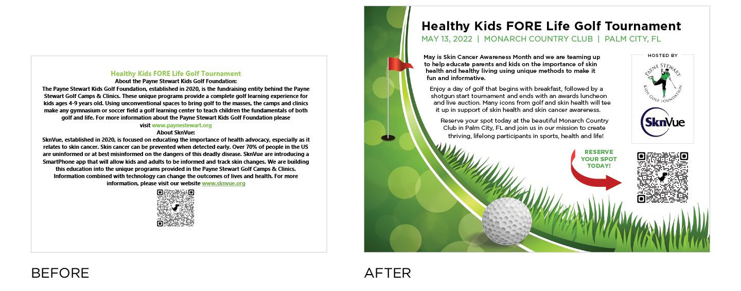
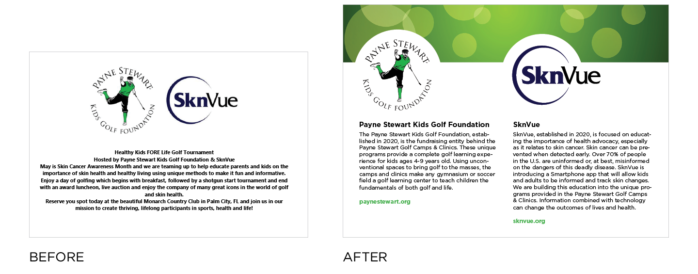
For people to connect with a business or organization, it is important that marketing materials are easy to read. Potential customers need to be able to quickly understand what the business is, the problem it solves, how to buy and where to find more information (website, social media, store location, etc). Keep your messages concise and don’t use jargon. Lastly, make sure that all marketing collateral is free of any kind of errors. Nothing throws doubt on a company’s credibility like seeing grammar and spelling errors! And, to that point, ensure that the website works, social media platforms are updated, chat boxes are being monitored and phone lines are being answered.

2. Crystal Clear Call-to-Action
What do you want readers to do after reading your marketing piece? The call-to-action (CTA) needs to provide a very clear path to prompt an immediate response or encourage an immediate sale. It should be obvious but very specific and create an urgency that drives a consumer to make a purchase. A CTA should focus on making a transaction, including:
- Shop our sale now
- Visit us online to buy now
- Get free shipping when you spend $100
It can also focus on a personal engagement between the buyer and the seller. Examples include:
- Call / DM us for a free consultation
- Sign up for a free 30-day trial
- RSVP to attend our event
No matter what the CTA is, the direction should be crystal clear, free of any ambiguities and impossible to miss.
3. On-point Visual Design
If you have a great message and a precise CTA, but your visual design is a mess, all that work will be for nothing because it will be lost in confusion. Having a properly designed marketing piece for a reader should do four things:
- Catch a consumer’s attention
- Direct the reader’s eyes
- Answer who, what, when, why and where
- Organize the information and graphics
A visual strategy for all your marketing collateral will provide order and present the most important information so it is easy to find and read, and subsequently make it easy for people to engage with the company.

4. Stay On Brand
Lastly, marketing collateral needs to be on brand, reflecting the proper logo, fonts, colors, key messages and design elements that are synonymous with the organization’s brand identity. Conduct a brand audit to make sure that old branding and messaging has been retired and isn’t lurking in the shadows. It is important to conduct a brand audit every 4-6 months to maintain continuity, identify gaps, and implement updates.
Creating an easily identifiable marketing mix with strong and well-built pieces goes a long way in building a trustworthy and credible business that will consistently retain customers and attract new ones.
Want to learn more? Email at bridget@creative-vortex.com to book a free 30-minute consultation!

